Routed letters
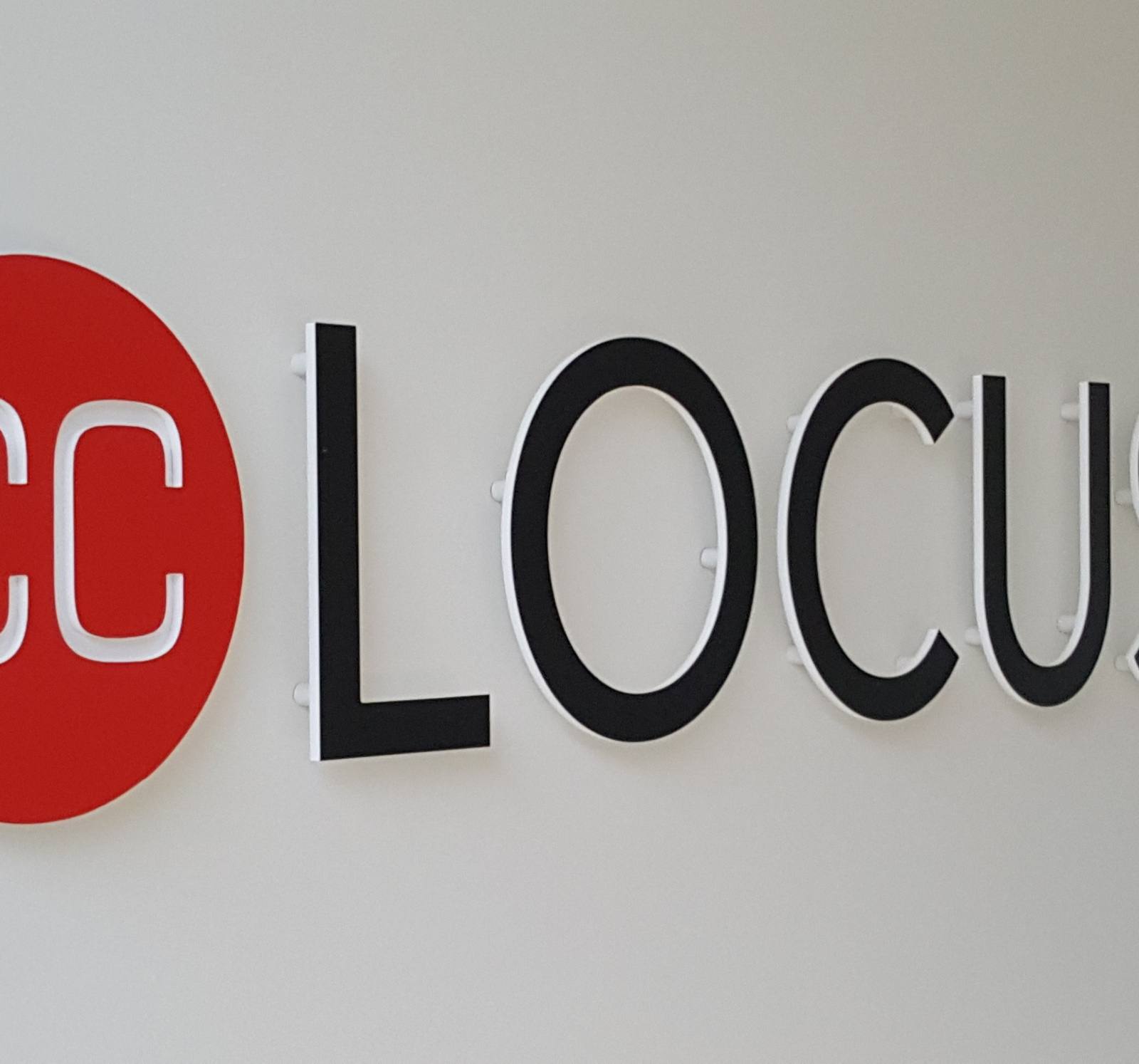
Individual letters and logos routed from sheet material, with a crisp, solid look. For façade, reception and interior.
Our approach
- 1Advice
We listen, measure up and think along.
- 23D design
Realistic visualisations for approval.
- 3Production
Custom work in our own workshops.
- 4Installation
Expert installation on site.
- 5Maintenance
Long-term service and maintenance.
What this gives you
From first sketch to maintenance — one partner who handles everything in-house.
One partner, from A to Z
You call one number. We measure, design, produce, install and maintain. No fragmented responsibility, no waiting on subcontractors pointing at each other.
You see it before it exists
A 3D visualisation of your own façade or space, by day and by night. We only start producing once that image is right. No surprises afterwards.
In-house production in Olen
Custom work from our own workshops, without intermediaries. That means a shorter lead time, a sharper price, and changes that are genuinely still possible.
Built to last
ISO 9001 and ISO 14001. Colourfast, weather-resistant materials and energy-efficient LED lighting. With long-term service and maintenance.
Routed letters: solid, sharp and timeless
Routed letters are individual letters and logos milled out of a sheet of material. No bending, no welding and no mounting frame is involved: each letter is a single solid piece with a clean, crisp edge. That is exactly why they look more substantial than printed lettering — the letter has thickness, catches the light and casts a shadow on the façade.
We draw, rout and install routed letters for façades, reception desks, meeting rooms, showrooms and interiors, for companies, local authorities, care institutions, schools and hospitality.
Why a routed letter rather than a sticker
Cut vinyl on a flat surface remains a two-dimensional image. A routed letter stands proud of the façade, and you see that difference straight away: in raking light a shadow line appears that lifts the letter off its background.
Service life counts too. Vinyl fades and lifts at the edges after a few years; a routed letter in aluminium or stainless steel lasts decades. For a name that has to stay up for a long time — the company name on the façade, the name of a building — that is the decisive consideration.
Materials
- Aluminium: the most common choice. Light, does not corrode, and can be powder-coated in any RAL colour or in a metallic finish. Suitable indoors and out.
- Stainless steel: the most premium look, brushed or polished. Heavier and more costly, but unbeatable on a prestigious façade or reception desk.
- Solid acrylic: colourful, affordable and with a deep gloss. Mainly indoors; outdoors it is more sensitive to UV.
- Aluminium composite: economical for larger letters where the weight has to stay down, with a flat finish.
- Plywood and solid timber: warm, at home in interiors and in hospitality.
- Corten steel: a warm rust colour, strong alongside greenery and natural stone.
The thickness of the material shapes the effect as well. A thin letter looks light and modern; a thick letter looks monumental. We show you that difference with samples before anything is routed.
Fixing: this is where you see the difference
The way the letters are mounted decides whether the result looks well finished or not.
On stand-offs
The letter sits a few centimetres off the façade, carried on concealed bushes. This gives a shadow effect and works on an uneven façade, because small differences in level disappear. Our standard choice for façades.
Bonded flush
The letter lies against the substrate. This calls for a flat, clean surface and is mainly advisable indoors.
With threaded rods into the façade
Concealed threaded rods in drilled holes, chemically anchored. The strongest option for heavy stainless steel letters.
On a backing plate
All letters mounted on a single backing panel, which installs faster and guarantees the alignment between them. Practical for long names and for mounting on a difficult substrate.
We always supply a drilling template, so that the letter spacing on the façade matches the drawing exactly.
Permits and the façade
Individual letters on a façade in Flanders generally require a Belgian planning permit, even without illumination, and the rules differ from one municipality to the next. In protected village views and on heritage buildings the regime is stricter, and sometimes only a non-penetrating fixing is allowed.
We help put the file together: a façade elevation with dimensions, a photomontage and the fixing detail. For insulated cladding or a cavity wall we establish in advance which anchoring will not damage the façade.
Illuminated or not
Routed letters are unlit in themselves. If you do want them to work after dark, there are two routes: a separate luminaire that washes the letters with light, or a switch to built-up letters with integrated illumination. The latter is a different product; see our page on illuminated signage.
What determines the price?
Routed letters have no fixed price per letter. The cost follows from the material and its thickness, the height of the letters and the number of characters, the complexity of the typeface — thin serifs and fine joins rout more slowly and are more fragile —, the finish and the colour, the method of fixing, the working height and whether a lift platform is needed, and the permit file if you outsource that to us.
Send us your logo as a vector file, the letter height you want and a photo of the façade, and you will receive a photomontage together with a fully substantiated quotation.
Putting your façade to us
Send us a few photos and your logo. We will draw a proposal to scale, indicate what is feasible in permit terms, and only then put a price to it.
Projects
All projects
Frequently asked questions
Wat is het verschil tussen dibond en forex?
Hoelang blijven de kleuren mooi?
Wat zijn freesletters?
Didn't find what you were looking for?
What you see here is a selection. Our range is considerably wider — in sizes, materials and finishes that we cannot all show online. Tell us what you need it for and where it has to go, and we will work out what fits.
Ask your questionReady to start your routed letters project?
We think along from the first sketch through to installation and maintenance.