Indoor signage & wayfinding
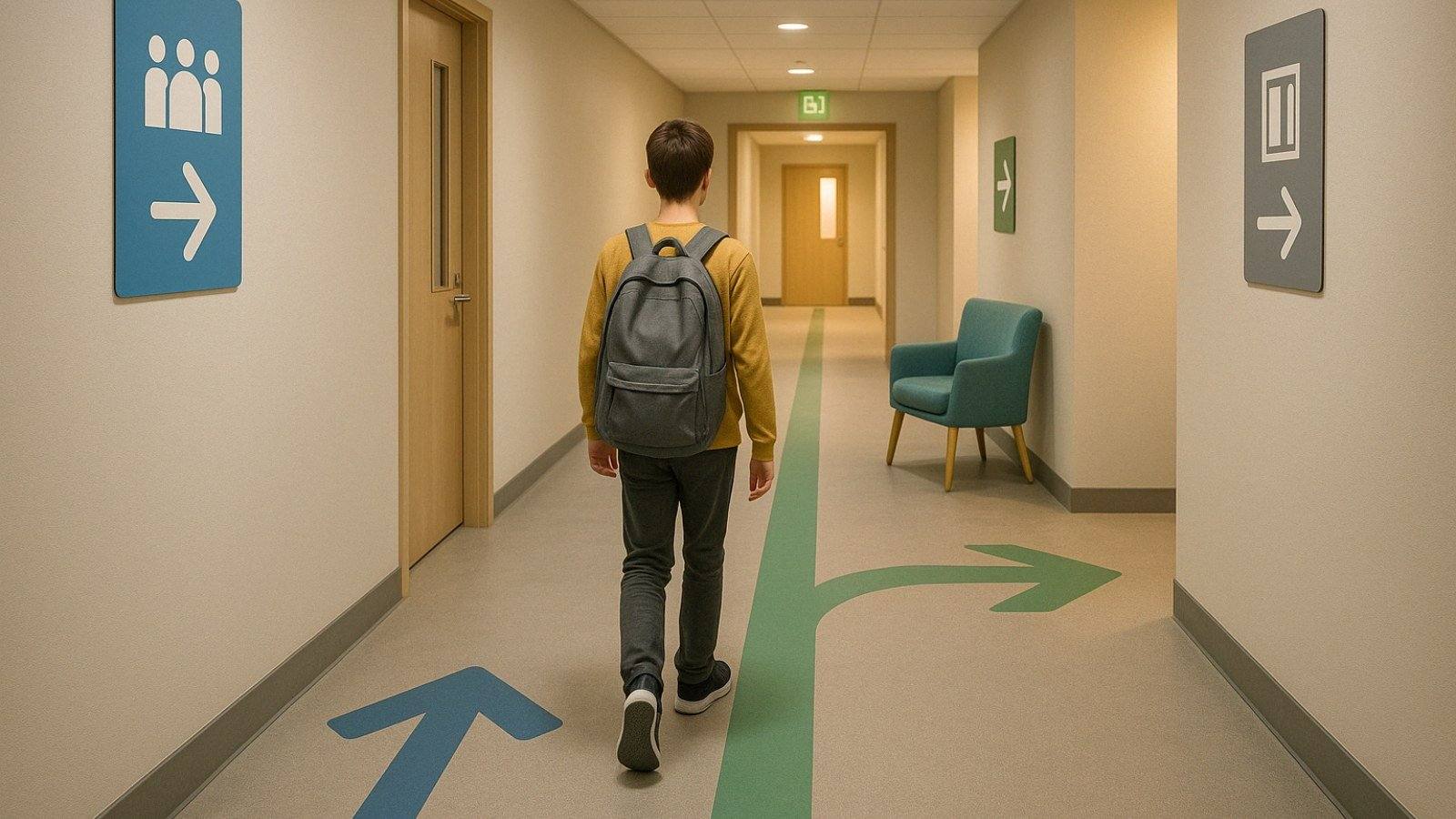
Wayfinding inside a building works best when nobody notices it. We start by analysing routes and decision points, and only then design the signs — usually fewer than what is already there, but noticeably more effective.
Our approach
- 1Advice
We listen, measure up and think along.
- 23D design
Realistic visualisations for approval.
- 3Production
Custom work in our own workshops.
- 4Installation
Expert installation on site.
- 5Maintenance
Long-term service and maintenance.
What this gives you
From first sketch to maintenance — one partner who handles everything in-house.
One partner, from A to Z
You call one number. We measure, design, produce, install and maintain. No fragmented responsibility, no waiting on subcontractors pointing at each other.
You see it before it exists
A 3D visualisation of your own façade or space, by day and by night. We only start producing once that image is right. No surprises afterwards.
In-house production in Olen
Custom work from our own workshops, without intermediaries. That means a shorter lead time, a sharper price, and changes that are genuinely still possible.
Built to last
ISO 9001 and ISO 14001. Colourfast, weather-resistant materials and energy-efficient LED lighting. With long-term service and maintenance.
What is wayfinding inside a building?
Wayfinding is the set of signs, pictograms, colours, numbering and floor plans that lets a visitor find their way without having to ask. It works well when nobody notices it, and is only noticed when it fails — at the cost of delays, irritation and sometimes missed appointments.
We design and deliver interior wayfinding for hospitals, schools, office buildings, sports complexes, public buildings and industrial sites. We always start with the route analysis, and only then with the signs.
What a wayfinding system consists of
General orientation
A plan at the entrance, a directory, sometimes a reception totem. They answer the question "where am I and what is here".
Directional signs
Placed at every decision point: corridor junctions, stair landings, lift lobbies. They carry arrows and a limited number of destinations.
Identification
Door signs, room numbers, department markers. They confirm arrival.
Confirmation
Small indications between two decision points, reassuring the visitor that they are still going the right way. Often forgotten, yet they make the difference in long corridors.
Regulation and safety
Escape routes, prohibitions and obligations. See our page on safety signage.
Where to place them
The basic rule: exactly one clear indication at each decision point, and nothing between decision points except confirmation. In practice that usually means fewer signs than are there today. A corridor with eight signs in four typefaces guides nobody; two well-placed signs do.
Mounting heights fall into three families: suspended or projecting for direction, at eye height beside doors for identification, and at floor level for routes in industrial or event settings.
Accessible and legible for everyone
- Letter height follows from reading distance: roughly one centimetre per three metres, more if people are moving.
- Contrast between text and background matters more than the colour chosen.
- One sans-serif typeface, in upper and lower case; capitals alone slow reading down.
- Five to six destinations per sign at most.
- Consistent wording from the first sign through to the door.
- Braille and tactile characters at a consistent height for blind visitors.
- Common pictograms for those who do not speak the language.
- A matt finish where light falls strongly.
Materials and versions
- Dibond and aluminium composite: rigid, flat, suited to large formats.
- Acrylic: a refined look, with reverse printing to protect the image.
- Anodised aluminium: understated and durable.
- System profiles with interchangeable inserts: the sensible choice where names change regularly, since only the text panel is replaced.
- Stickers on doors and glazing: economical, including frosted versions.
- Tactile and braille signs: for accessible door signage.
Installation and maintenance
Installation is by bonding, screwing, suspending or on a profile, depending on the substrate and on whether drilling is permitted — a point to check in leased and listed buildings. We take measurements, draw a sign schedule and install.
Maintenance is minimal, but keeping the system current is not: organisations change. That is why we supply a signage plan listing materials, colours, typefaces and references, so your facilities team can order identical signs themselves, even years later.
What determines the price?
- The number of signs and the number of different formats.
- The choice of material and expected service life.
- Interchangeable systems versus fixed signs.
- Whether a design and route-analysis phase is required.
- Installation: height, substrate type, whether drilling is permitted, working hours.
- Special requirements: braille, tactile characters, vandal-resistant versions.
Send us your floor plan and the list of destinations, and you will receive a sign schedule together with a quotation itemising every position, executable in phases if required.
Send us your building
Send the floor plan, or take a short walk with your phone and send the photographs. We will point out where visitors get lost and propose a coherent plan.
Projects
All projects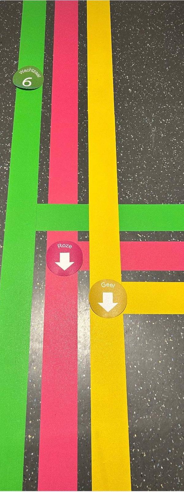
Frequently asked questions
Hoe groot moeten de letters op een bord zijn?
Hoeveel bestemmingen mogen op één bord?
Wat als afdelingen verhuizen of van naam veranderen?
Is braille verplicht op deurbordjes?
Kunnen jullie ons bestaande bordenpark saneren?
Wat bepaalt de prijs van een bewegwijzeringsproject?
Didn't find what you were looking for?
What you see here is a selection. Our range is considerably wider — in sizes, materials and finishes that we cannot all show online. Tell us what you need it for and where it has to go, and we will work out what fits.
Ask your questionReady to start your indoor signage & wayfinding project?
We think along from the first sketch through to installation and maintenance.