Safety signage in the workplace: what is required and what works
What is legally required in safety signage, how does the system of shapes and colours work, and why does the price differ?
Safety signage is the kind of subject nobody considers urgent until it suddenly is. An inspection visit, an incident, a new machine, a refurbishment that moves the escape route — and all at once it turns out that the signs on the wall no longer match the situation, or that they never did.
That is rarely unwillingness. Safety signs are usually put up by someone who meant well, with whatever material happened to be available, at the moment it seemed necessary. Five years later there is a collection that is partly faded, partly no longer in line with the layout of the building, and of which nobody remembers why exactly that sign hangs there.
This article sets out what is legally expected of you, how the system of shapes and colours works, where things go wrong in practice, and why the price of a signage project varies so much.
The legal framework in brief
In Belgium, safety and health signage at work is governed by the Code on well-being at work, which in turn transposes the European directive on safety signage. The core of those rules is simpler than it sounds and comes down to three principles.
Signage is a supplement, not a solution. You cannot sign a risk away. First comes removing or shielding the hazard; only what remains after that is signposted. A sign at a hazard you could have eliminated is not compliance but an alibi.
The signage must be understandable without language. That is why the system works with standardised pictograms, shapes and colours. Someone who does not speak the language — a temporary worker, an external technician, a driver making a delivery — must still understand the message.
It must remain visible and legible. A sign that has faded, hangs behind a rack or only becomes visible once you have already passed it does not serve its purpose. Maintenance and placement are therefore just as decisive as the sign itself.
In addition, employees must know what the signage means. This duty to inform is often forgotten: putting up signs without explaining them during induction or training is only half a measure. What applies exactly depends on your sector, your activities and the risk assessment of your specific situation. This article provides the framework; the translation to your site we make together, in consultation with your prevention adviser.
The system of shapes and colours
The logic behind safety signage is that you recognise the meaning before you have read the pictogram. Shape and colour carry the message; the pictogram makes it specific.
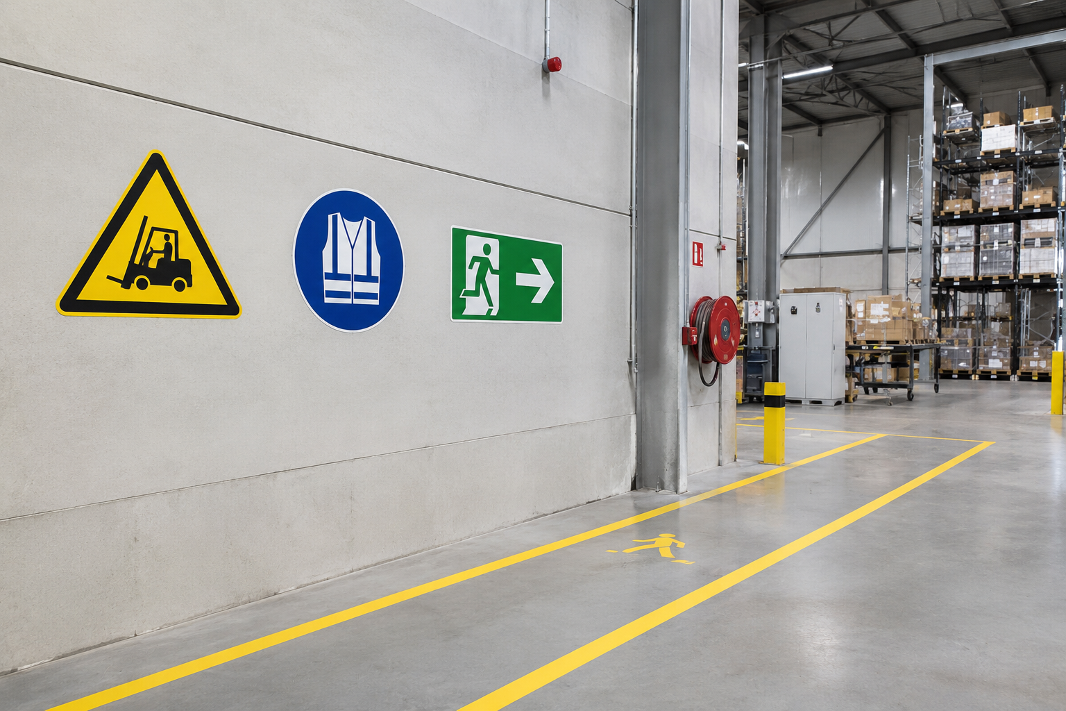
Round with a red border and a diagonal bar means prohibition. No smoking, no access for unauthorised persons, do not extinguish with water. The message is: this is something you must not do here.
Triangular with a yellow background and a black border means warning. Trip hazard, electrical voltage, forklift traffic, corrosive substances. The message is: there is a hazard here that you must take into account.
Round with a blue background means a mandatory action. Safety glasses required, hearing protection required, safety shoes required. The message is: this is something you must do here.
Square or rectangular with a green background stands for rescue and safety. Emergency exit, escape route, assembly point, first-aid post, eye wash station. The message is: here you will find help or a safe way out.
Square or rectangular with a red background stands for fire fighting. Fire extinguisher, hose reel, fire alarm. The message is: fire-fighting equipment is located here.
The pictograms themselves are internationally standardised, so that the same symbol carries the same meaning everywhere. That is precisely why self-designed signs or creative variants are a bad idea: they break the recognisability the entire system rests on. Applying your own house style to safety signage is one of the few places where we advise clients not to extend their brand.
Where things go wrong in practice
In the projects we see, the same problems keep recurring. None of them is dramatic in itself, but together they undermine the system.
Signs that no longer match the building. A wall is moved, a door is closed up, a department relocates — and the signage to the emergency exit still points to the old situation. This is the most dangerous of all the problems, because in an emergency people follow signage without thinking.
Faded or soiled signs. Especially outdoors and in production environments. A yellow warning sign that has faded to white is literally no longer recognised as a warning.
Too many signs. This is the least intuitive mistake. Whoever hangs something on every wall creates visual noise in which the genuinely important messages disappear. Signage works on the basis of exception: if everything stands out, nothing stands out.
Signs at the wrong height or behind obstacles. A sign at eye level in an empty space is something different from the same sign in a warehouse where racking reaches the ceiling. Placement should follow the actual walking route, not the building plans.
No photoluminescent version where it is needed. Escape route signage that becomes invisible during a power cut is useless at the decisive moment. Photoluminescent material remains legible for a considerable time after the lighting fails.
A separate approach per department. Every department orders something itself, in a different format and a different finish. The result is a building in which the signage looks different from zone to zone — precisely the opposite of a system that relies on recognition.
From loose signs to a signage plan
The shift that yields the most is this: stop ordering signs and start with a plan.
A signage plan starts not from products but from routes and risks. Where do people come in? What route do they take? Where are the hazards, the extinguishers, the exits? Who moves around here — permanent staff who know everything, or also visitors, drivers and external parties seeing the building for the first time?
That analysis naturally shows what needs to go where, and usually also that fewer signs are needed than expected — but in better places. An added benefit: you get a document you can keep up to date. If the layout changes, you adjust the plan and immediately see which signs need to change with it.
For larger sites we recommend combining that exercise with the wayfinding. Safety signage and wayfinding share the same walking routes and the same audience. Tackling them separately leads to duplicated work and to walls where two systems compete for attention side by side.
Material and finish
The environment determines the finish. What lasts for years inside an office becomes illegible within a year outdoors or in a production hall.
Indoors, in an office environment. Lighter versions are sufficient. Attention goes mainly to fixing without damaging the finishes, and to consistency with the rest of the wayfinding.
Production, warehouse and workshop. Here resistance to impact, dirt, cleaning products and sometimes chemicals is what counts. More robust materials and a surface treatment that can be cleaned without wearing away.
Outdoors. Rain, frost, UV and road salt. The finish must withstand all of this, and colourfastness is the critical point here — precisely because the colour carries the meaning.
Escape route signage. Photoluminescent material where the lighting can fail, with enough afterglow time to evacuate the building.
Floor signage. In warehouses and production environments, marking on the floor is often more effective than a sign on the wall: walkways, forklift zones, storage bays, safety distances. People look at where they are walking.
Why the price differs so much
Two companies that both want to put their safety signage in order rarely receive a comparable quotation. That is not arbitrary but the result of real differences.
The size of the site and the number of points. A workshop with twenty signs is something different from a production site with several buildings and hundreds of points.
Whether a plan has to be drawn up. If you know exactly what needs to go where, it is a supply question. If the analysis still has to be done — routes, risks, zones — that involves study work which pays for itself later in fewer and better-placed signs.
The finish per environment. Indoors, outdoors, photoluminescent, chemically resistant or floor-fast: each requires a different material with a different cost and lifespan.
The mounting method and the substrate. Fixing to plasterboard, concrete, steel or glass each requires something different. Working at height or in a running production environment also weighs in.
Bespoke work and site-specific signs. Standardised pictograms are available off the shelf. Zone markings, floor plans and site-specific information boards are bespoke.
Timing and phasing. Working during a production shutdown or outside office hours affects the schedule and therefore the cost.
That is why we do not work with a catalogue rate, but with a proposal that fits your site and your risks. That way you pay for what is genuinely needed — not for signs you did not need, and not too little for a finish that gives up after a year. The concrete figures can be found in the Herva-Doublet Platform.
How we approach such a project
We start by walking around. Not with a catalogue, but with a walk across your site, together with whoever knows the risks — usually the prevention adviser or the facility manager. That walk-through produces an overview of what is in place, what is missing, what can go and what needs replacing.
After that we draw up a proposal that follows the logic of your building rather than that of a product group. Design, production and installation come from one hand, which means you have one point of contact and one party responsible for the whole — including alignment with your wayfinding, your house style and the rest of your visual communication. Would you like to know whether your signage is still correct? Request an advisory meeting — we are happy to walk around with you.
Frequently asked questions
Ready to take the next step?
Request a 3D design or an advisory meeting, or request access to prices in the Herva-Doublet Platform.