Advertising totem: being visible from the street
When do you choose a totem instead of facade signage? Types, legibility, foundations, permits and why the price differs.
There is a category of companies with a good building, decent facade signage and yet they are structurally overlooked. They are located on a business park where the facade does not face the road. Or at the back of a site where visitors first have to negotiate three junctions. Or in a retail park where five tenants compete for the same attention.
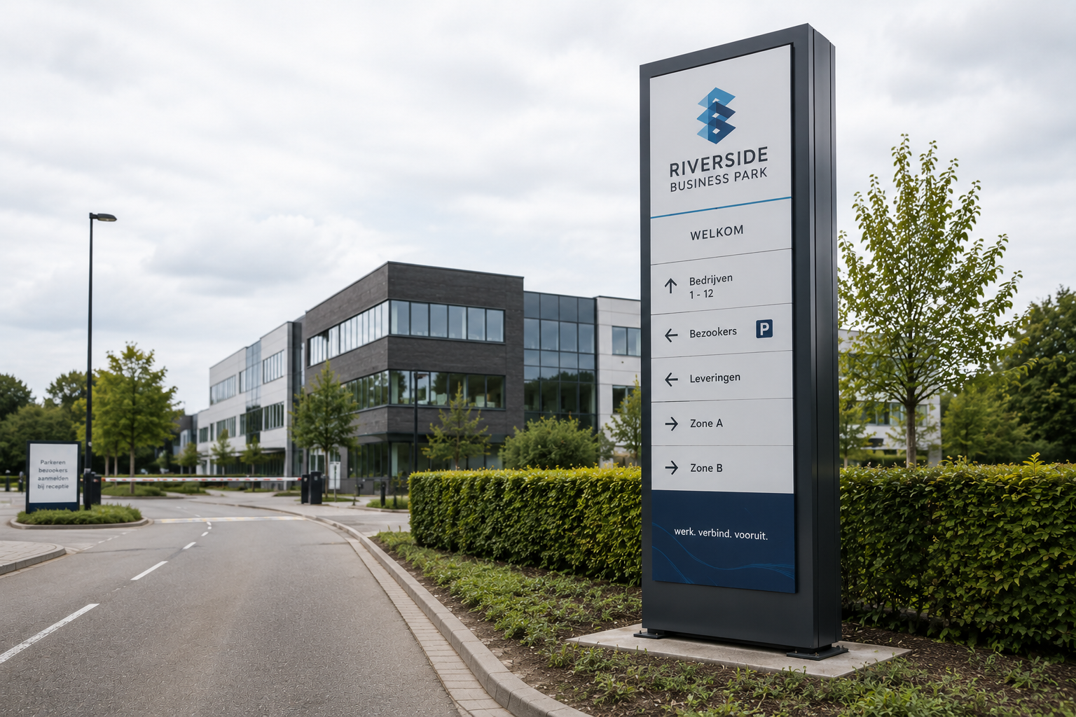
The totem exists for those situations: a free-standing, vertical carrier that brings your name to the place where people are looking, instead of waiting until they are standing at your facade.
It is one of the most underestimated solutions in visual communication, and at the same time one where the execution makes an enormous difference. A totem that stands too low, is too crowded with text or has been founded in the wrong place costs just as much as one that works — but delivers nothing. This article is about how you make that difference.
When a totem is the better choice
Facade signage and a totem do not solve the same problem. The rule of thumb is simple: facade signage confirms where you are, a totem tells people that you are there at all.
Business parks. Your facade is beautiful, but it stands at right angles to the access road. Anyone driving past sees a side wall. A totem at the edge of your plot or at the entrance to the park catches the eye at the moment someone still has to decide whether to turn off.
Sites with a driveway or a building set back. If your building is twenty or two hundred metres from the road, the facade is simply too far away to read. The totem brings your name to the building line.
Retail parks and multi-occupancy buildings. Several tenants on one site means a shared carrier is needed. A well-designed multi-tenant totem gives every party a legible place without the whole thing turning into a noticeboard.
Car parks and large sites. In a car park it is often not only about the name but also about orientation: where is the entrance, where do I need to be, which zone is this. Totem and wayfinding merge here.
Care sites, campuses and public buildings. Visitors usually come once and are often in a hurry or tense. A totem at the entrance that immediately makes clear where you are driving in takes away part of that stress.
Car dealerships and showrooms. Traditionally heavy users of totems, because the customer has to see from the road which brand or which service to expect.
When a totem is not the answer
Is your facade right on the road, clearly visible and within reading distance? Then facade signage solves it better and more cheaply. Adding a totem then delivers little extra visibility and makes the picture busier. In locations where planning rules leave little room too — a historic centre, a protected view — a totem is rarely the path of least resistance.
The types at a glance
Totems differ in construction, lighting and degree of customisation. These are the main lines.
Non-illuminated totems. A free-standing carrier with printed or applied lettering, without its own light source. Robust, low-maintenance and the most direct solution when daytime visibility is enough. With good placement and sufficient contrast they remain reasonably legible at dusk as well, certainly if there is site lighting nearby.
Illuminated totems. With internal lighting that makes the lettering or the entire surface glow. The difference from a non-illuminated totem is not gradual but categorical: outside daylight hours a non-illuminated totem simply ceases to exist, whereas an illuminated one stands out most precisely then. For businesses with evening opening hours, for care sites and for locations along busy roads that weighs heavily.
Totems with screen technology. A digital surface that can display changing content. Interesting where the message changes regularly — opening hours, promotions, waiting times, welcome messages — or where several parties share the same carrier and appear in turn. It does require a power supply, a data connection and someone to manage the content.
Multi-tenant totems. Built up from modules or panels so that several companies appear on the same carrier. The challenge is not technical but editorial: how many parties can go on it before nobody is legible any more. Our experience is that this number is lower than clients hope. Better five legible names than ten that nobody deciphers.
Bespoke totems. Where shape, material and finish also carry the brand story. Think of a totem that echoes the facade materials of the building, or a shape that follows from the house style. More expensive, but in locations where first impressions count often worth the investment.
Visibility is arithmetic, not taste
This is where things most often go wrong in practice. A totem is designed on a screen, where everything looks legible, and only after installation does it turn out that nobody can read it from the road.
Viewing distance determines letter height. A workable rule of thumb is roughly one centimetre of letter height per three to four metres of viewing distance. If your name has to be legible from fifty metres, you are therefore talking about letters of some fifteen centimetres — and that is for the name, not for the secondary details. Anyone who wants their services, telephone number and website in the same size will be disappointed.
Speed halves your time. Along a road where people drive at fifty an hour, you have a few seconds. That means: one message, two at most. Name and possibly activity. Everything added on top reduces the chance that even the name sticks.
Contrast does more than size. Dark letters on a light surface or the other way round remain legible at a distance; colour on colour with little contrast disappears, however large you print it.
Height follows from obstacles, not from ambition. What matters is not how high a totem may be, but what stands in between: hedges, parked lorries, an embankment, street trees in summer. A totem that is perfectly visible in winter and disappears behind the foliage in June is half a totem.
Look from the direction of travel, not from the plot. The position should be determined from the point of view of the person arriving — and usually people arrive from two directions. That is exactly why a double-sided version is often more logical than it seems at first sight.
Foundations and wind loading
A totem is a tall, flat object that stands outdoors permanently. That makes wind not a detail but a design parameter.
The taller and wider the surface, the greater the force acting on it in a storm. The foundation has to absorb those forces, and what is needed for that depends on the soil conditions on site. Sandy soil behaves differently from clay; existing concrete paving calls for a different approach than a green area.
This is why a price for a three-metre totem without knowledge of the location means very little. Two identical totems, a hundred metres apart, may require different foundations. And it is also the item most often underestimated in a cheap quotation — resulting in a totem that leans after a couple of winters.
A practical point that is often forgotten: underground pipes and utilities. Digging a foundation pit on a business park requires checking in advance what is in the ground.
Permits
Municipal planning rules apply to a free-standing advertising carrier, and they vary considerably. Dimensions, height, distance to the building line, lighting and sometimes even the colour may be regulated. On some business parks there are additional rules set by the site manager that are stricter than the municipal ones.
Expect this to take time and start early. We include it in the file as standard: checking which procedure applies, what has to be submitted and how long it realistically takes. That way the permit does not suddenly end up on the critical path of your opening or relocation.
Material, finish and service life
A totem stands outdoors year in, year out and is moreover one of the first things a visitor sees. Weathering is therefore immediately noticeable here.
The supporting structure requires a weather-resistant design with a solid surface treatment, resistant to rain, frost, UV and road salt. For the printed or lettered parts, colour fastness is the critical point: a faded logo detracts more from your image than having no totem at all. In illuminated versions the quality of the components determines how long the image stays even — lighting that fails unevenly looks scruffier than no lighting.
Maintenance is limited: periodic cleaning, checking the fixings and, in illuminated versions, verifying that everything still works. Most of the problems we encounter are not caused by wear but by too light a design at the outset.
Why the price differs so much
Two companies that both ask for a totem at the entrance rarely receive the same quotation. The differences lie here.
The dimensions. Height and width determine the construction, and the construction in turn determines the foundation. The jump from modest to imposing is not a linear price increase.
Lighting or no lighting, and which type. This is usually the single biggest factor after the dimensions — it changes the construction, the power supply and the installation.
Single- or double-sided. A double-sided version is more than twice the same surface: it requires a different construction.
The foundation and the subsoil. As described above: this is location-specific and the difference can be considerable.
The degree of customisation. A standardised shape is in a different order of magnitude from a totem that echoes a facade material or follows a specific shape.
Power supply and installation. Does a power feed still have to be run? Is the location easily accessible for a crane and equipment? Are there utility lines that affect the excavation work?
Permit and lead time. The procedure itself, and sometimes the adjustments that follow from it.
That is why we work with a proposal tailored to your location instead of a rate from a catalogue. That way you pay for what your situation genuinely requires — not too much for unnecessary dimensions, and not too little for a foundation that has to hold. You will find the actual figures in the Herva-Doublet Platform.
One image across your entire site
A totem rarely stands alone. Most sites also have facade signage, wayfinding, parking indications and sometimes flags at the entrance. Anyone who orders those elements separately ends up with a site where every component looks just slightly different: a different shade of blue, a different typeface, a different finish.
That is exactly where we make the difference. Facade signage, totems, wayfinding, street furniture and branding all come from one hand with us, from design to installation. One point of contact, one brand identity, one file — and a site that feels as though it was meant that way. Wondering whether a totem solves your visibility problem? Request an advisory meeting. We are happy to look at your location and the directions of approach together.
Frequently asked questions
Further reading
Related articles
Ready to take the next step?
Request a 3D design or an advisory meeting, or request access to prices in the Herva-Doublet Platform.