Wayfinding in healthcare: why good signage measurably reduces visitor stress
Colour zones, iconography and clear overview maps measurably lower the stress levels of patients and visitors in hospitals.
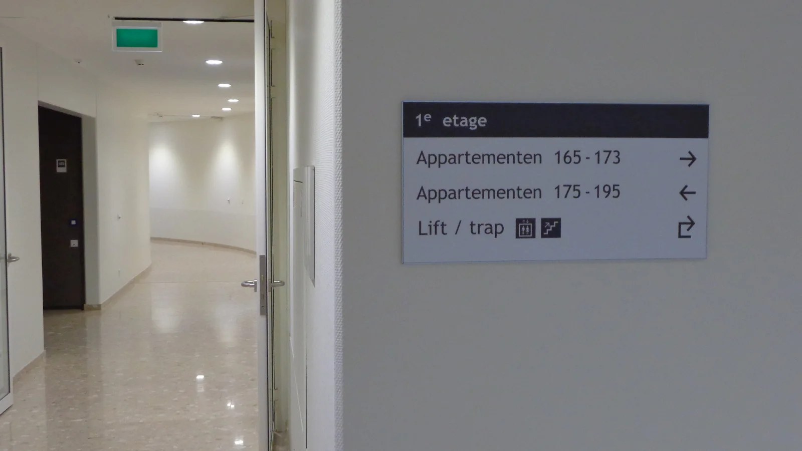
In a hospital or care home, the care experience starts the moment you step inside. Those who feel lost arrive tense at their appointment; those who can orient themselves immediately are already half at ease. Wayfinding is not decoration — it is a clinical parameter.
Colour zones as a first layer
The strongest hospitals split their building into 4 to 6 clearly coloured zones (e.g. "blue zone" for consultations, "green zone" for day hospital). That colour returns on floor bands, ceiling totems and wayfinding signs. Visitors follow the colour intuitively — even those who don't fully speak the local language.
Consistent iconography
Use a single pictogram family everywhere, and follow ISO 7010 for safety signage (emergency exit, first aid, defibrillator). Visitors recognise these icons from other buildings — which is exactly the point.
Overview maps at every junction
At every lift, junction and entrance, place a "You are here" map. Important: always align the map with the visitor's line of sight, not north-up. This single detail dramatically cuts orientation time.
Digital and static
Digital screens are perfect for daily schedules, waiting times or temporary detours. But the backbone of your wayfinding must always be static and physical — screens fail, paper tears, and under stress people look at the wall, not at a tablet.
Screens are useful for information that changes: waiting times, a room's schedule, an appointment call, temporary diversions during works. They are unsuitable as a replacement for fixed signage, for a simple reason: a screen that fails leaves the visitor with nothing, whereas a sign always stays in place.
The sensible division is therefore: fixed signage for the structure of the building, screens for what is different today from yesterday.
Get advice from the drawing board
Wayfinding works best when it's designed together with the building, not stuck on afterwards. We work with architects and clients from the concept phase — with a concrete zone system, iconography and integration into facade and interior.
Wayfinding follows decision points, not walls
The most common mistake in a care building is putting up signs where there is space. Signage belongs where someone has to make a choice: at the entrance, at every junction, at the lift, on every floor when stepping out. Everywhere else, a sign is redundant — and redundant signs make the necessary ones harder to find.
The opposite mistake is just as common: a long corridor without any confirmation. Anyone walking thirty metres without seeing a sign starts to doubt they are still on the right path and sometimes turns back. A short confirmation halfway — same destination, same colour — prevents that.
So walk the route as a visitor does, from the car park to the department door, and note every point where you yourself have to pause and think. That is exactly where information belongs. It sounds simple, but it is an exercise that rarely happens in practice because the people who know the building no longer hesitate.
Name destinations the way visitors name them
Internal names are the silent killers of good wayfinding. A visitor with an appointment letter for "cardiology" looks for cardiology, not "Block C — level 2 — internal outpatient clinic". A relative coming to visit looks for the department name as it was given on the phone.
The rule is therefore: the signage uses the words from the appointment letter, the website and the phone call. If those differ from one another, that is the first thing to be fixed — before a single sign is ordered. Wayfinding cannot resolve inconsistent naming, it only makes it visible.
Limit the number of destinations per sign as well. More than five or six lines is no longer read but scanned, and when scanning people lose precisely the line they were looking for. Better two signs in a row, each with a short list, than one sign with everything on it.
Legibility and accessibility
In healthcare the audience is by definition broader than average: older people, people with a visual impairment, people who don't speak the language fluently, people who are tense or in a hurry. What works for them works for everyone.
Contrast matters more than size. Dark text on a light background or vice versa stays legible for those who see less sharply; grey on light grey disappears, however large you make it.
Hang at the right height. Information you need to see from afar goes high or on the ceiling; information you read up close — a door plate, a floor plan — belongs at eye level, and for floor plans preferably at a height that is also readable when seated.
Use pictograms as a supplement, not a replacement. An internationally recognised symbol next to the word helps those who don't read the language. A self-invented symbol without the word helps no one.
Think about multilingualism. In many Belgian care institutions Dutch alone is not enough. Two languages on a sign is workable, three usually becomes too crowded — pictograms and colour zones help reduce the number of words.
What goes wrong after handover
Wayfinding ages not through wear but through change. A department moves, a corridor is closed off, a name changes — and what hangs on the wall no longer matches.
The recognisable consequence is the laminated A4 sheet with an arrow, taped to the sign. Every care building has them. They are not carelessness but a symptom: a problem has been flagged but there is no procedure to resolve it.
Two measures help. Choose systems with interchangeable insert strips at the design stage, so a name change doesn't require a new sign. And establish who is responsible for updating the wayfinding when something changes in the building — with a plan that is adapted rather than a list of signs that nobody manages.
From walkthrough to plan
We start such a project by walking through, together with someone who knows the building and preferably also someone from reception — who knows better than anyone which question is asked most often and therefore where the wayfinding falls short. From that follows an overview of the routes, the decision points, the existing signs and the gaps between them.
Then we draw up a plan that follows the logic of your building rather than that of a product group. Design, production and installation come from a single hand, and the wayfinding is aligned with the safety signage, the house style and the interior finish — so the whole is coherent instead of three systems competing for attention on the same wall.
Why the price varies so much
The size of the building and the number of decision points, whether the plan still needs to be drawn up or is already fixed, the execution per zone, the mounting method and the substrate, the degree of custom work for floor plans and zone markings, and whether work is done in phases or outside visiting hours: these factors together explain why two care institutions with the same request receive very different quotes.
That is why we work with a proposal tailored to your building. The specific amounts are available in the Herva-Doublet Platform.
Frequently asked questions
Ready to take the next step?
Request a 3D design or an advisory meeting, or request access to prices in the Herva-Doublet Platform.