Facade signage that stands out without shouting: 5 principles
How milled letters, backlit cassettes and LED striping can create a facade that comes alive at night and still fits the building by day.
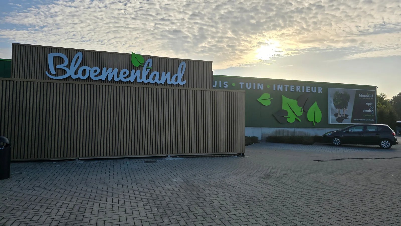
A facade sign has to win two conversations at once: the daytime one with the architecture, and the evening one with the streetlight. The best facades manage this through restraint in materials and uncompromising execution.
1. Choose the right technique for your facade
A crisp, modern facade usually calls for milled letters or slot-cut cassettes with halo lighting. A classical or heritage facade is better served by discreet box letters or a non-lit brass plate. Technique should follow the architecture, not the other way around.
2. Stick to one material, one finish
Don't mix brushed aluminium with mirror-polished stainless in the same sign. Pick one material — ideally matching an existing facade detail — and keep the finish consistent. That is the difference between "striking" and "loud".
3. LED only where it adds value
LED striping along facade lines transforms a building at night, but must be invisible by day. Use slim aluminium profiles that integrate architecturally. Avoid loose LED strips and visible power supplies — they look cheap.
4. Design for two scales
Your facade is read from far away and up close. Make sure the main logo stays legible at 50 metres, but add a second layer: a subtle street-number or opening-hours plate at eye level. That detail layer is what makes a facade look genuinely professional.
5. Start from a 3D design
A 2D sketch always lies. Ask for a 3D visualisation integrated into a photo of your actual facade — that's where you see whether the proportions are right and whether the sign lifts or flattens the architecture. We always deliver a 3D design before production.
What happens to your facade in the evening
By day your facade competes with everything standing next to it. In the evening it only competes with whatever gives off light — and that is precisely why illuminated facade signage draws far more attention than its surface area would suggest.
The difference lies not in the amount of light but in the way it is delivered. A surface that lights up completely suggests a light box and rarely suits a carefully designed facade. Letters lit from behind so that a halo falls onto the facade give exactly the same visibility with a far calmer image — and they show the architecture instead of drowning it out. For offices, care institutions and companies where restraint is part of the image, that is almost always the better choice.
Two practical points that are often forgotten. First: the facade itself determines what halo lighting looks like. A light, flat surface reflects nicely; a dark or coarsely textured facade swallows the light, so that the effect largely disappears. Second: switch the lighting. Signage that burns all night on a business park where nobody passes after ten o'clock costs energy without delivering anything, and more and more municipalities also impose rules on light pollution and switch-off times.
Legibility from the street
Facade signage is rarely read from close by. It is read from a car, from the other side of the street or in passing — and that is a very different reading behaviour from the one you experience when you assess the design on a screen.
A useful rule of thumb for letter height is roughly one centimetre per three to four metres of viewing distance. If your name has to be legible from forty metres, you end up with letters of well over ten centimetres — and that applies to the name, not to the strapline, the telephone number or the website. Anyone who wants everything the same size in practice makes nothing legible.
Contrast carries more weight here than size. Dark on light or light on dark stays legible at a distance; colour on colour with little difference falls away however large you make it. And do not forget the surroundings: what reads perfectly on a white wall disappears on a facade of smoked glass.
Material, finish and service life
Facade signage hangs outside for years and is one of the first things a visitor or passer-by sees. Weathering therefore shows up immediately — a faded or oxidised sign damages your image more than no sign at all.
The surface treatment determines how it ages. A properly treated version keeps its colour and gloss for years; too light a specification shows deposits after a few winters in the places where water stands, usually along the lower edge of letters and behind the fixings. With illuminated versions, the quality of the components determines how long the image stays even: lighting that fails unevenly looks scruffier than no lighting at all.
Maintenance is limited to periodic cleaning and checking the fixings and, on illuminated versions, the operation. Most of the problems we come across are not caused by wear but by too light a specification at the outset.
Fixing and the facade itself
How the sign is fixed depends on what it goes onto. Masonry, concrete, insulated cladding, sandwich panels, glass or a ventilated facade each call for a different approach — and with an insulated or ventilated facade there is the additional point that you must not break through the build-up without thinking about watertightness and cold bridges.
Two questions therefore need to be asked early: what is behind the facade cladding, and who is responsible if a leak occurs later? In rented premises there is the added question of how the facade will be made good on departure. We include those points in the file as standard and, in the case of a renovation or new build, are happy to look together with the architect at where the fixing can be provided for in advance.
Permits
Facade signage is subject to municipal planning rules that differ greatly from one municipality to another: dimensions, projection, lighting and sometimes even the colour may be regulated. In a protected townscape or village setting and on listed facades the requirements are stricter, and some shopping centres have separate regulations for the streetscape.
Count on this taking time and start early, certainly when the signage has to be ready for an opening or a move. We find out as standard which procedure applies, what has to be submitted and how long that realistically takes.
Why the price varies so much
Two companies that both want their name on the facade rarely receive the same quotation. The differences lie in the technique, illuminated or non-illuminated, the dimensions and the letter height, the choice of material and the finish, the nature of the facade and the fixing, the accessibility for installation at height, and the permit procedure.
That is why we work with a proposal tailored to your facade instead of a rate from a catalogue. That way you pay for what your situation genuinely requires. You will find the actual amounts in the Herva-Doublet Platform.
Frequently asked questions
Further reading
Related articles
Ready to take the next step?
Request a 3D design or an advisory meeting, or request access to prices in the Herva-Doublet Platform.