Illuminated signage and channel letters: what suits your facade?
Channel letters, halo backlighting or a light box? Which technique suits your facade, what the permit requires and why the price differs.
A facade without illuminated signage does not exist in the evening. That sounds harsh, but it is literally the case: from the moment it gets dark, a passer-by only sees what gives off light. Anyone who depends on passing trade — a shop, a showroom, a hospitality business, a healthcare practice with evening consultations — thereby loses half the day in visibility.
Yet "let's just add light" is too quick a conclusion. Illuminated signage comes in various techniques, each of which produces a different look, assumes a different facade and has a different lifespan. And the choice between those techniques is not without consequence: it determines whether your facade will still look well kept in eight years' time or not.
This article sets out the techniques, explains when each one is appropriate, and addresses the points that most often go wrong in practice: the facade itself, the permit, and why the price differs so much.
The techniques at a glance
Channel letters with front lighting. Individual letters, each a closed volume of its own, with a translucent front face that lights up. This is what most people mean when they say illuminated letters. The look is pronounced and clearly legible from a distance — the letters themselves light up, so the message is immediately clear. Because each letter is a separate volume, the facade remains visible in between, which looks calmer than one large illuminated panel. Suitable for shops, showrooms, hospitality businesses and companies along a road where you need to be read from afar.
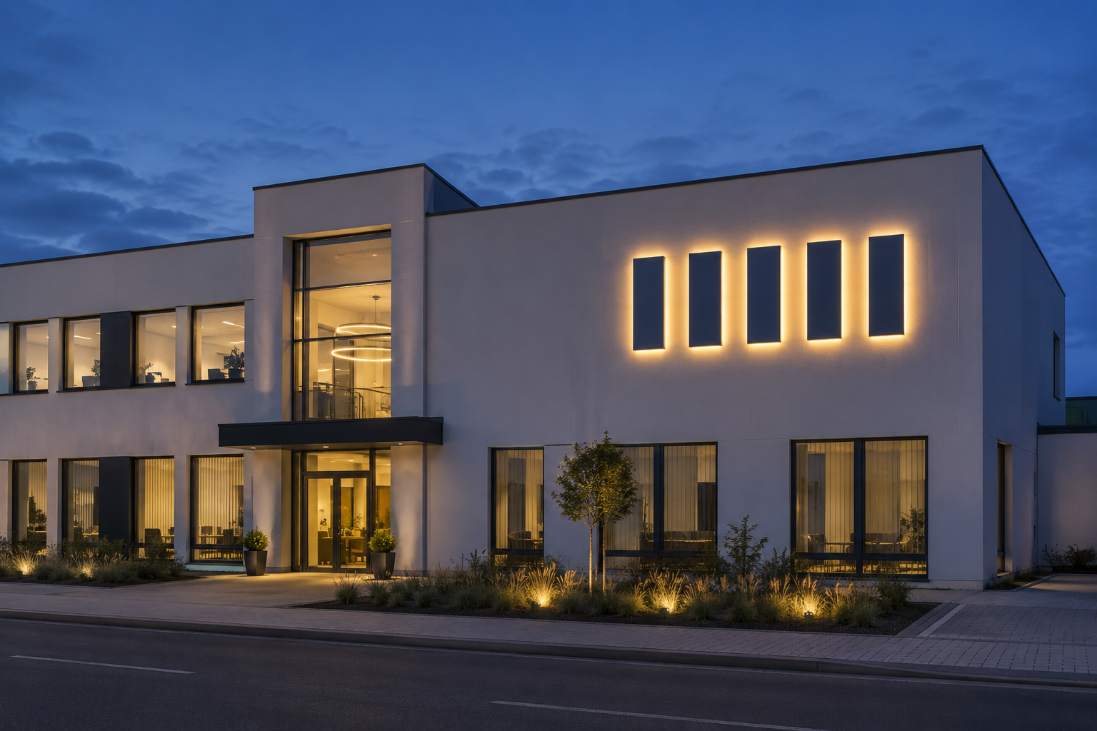
Channel letters with rear lighting, the halo effect. The same individual letters, but with a closed front face and lighting directed towards the facade. The letter itself stays dark; a halo of light appears on the wall around it. This is the most refined execution and the choice of virtually every architectural practice, office or care institution where restraint is part of the image. The effect showcases the architecture instead of drowning it out.
An important condition for halo lighting: the facade has to support it. A light, flat surface reflects beautifully. A dark facade, tinted glass or a coarsely textured cladding swallows the light, after which little of the effect remains. This is one of the few cases in which we explicitly advise a client against what they are asking for: anyone wanting halo lighting on an anthracite facade is paying for something they will not see.
Channel letters with both front and rear lighting. The combination: an illuminated front face plus a halo. Strong where you want to be legible from a distance and keep a refined look up close. More expensive, and it requires a facade that can handle the halo part.
Light boxes. A closed casing with a translucent front face carrying the message, as a single unit rather than as individual letters. Single-sided against the facade, or double-sided at right angles to the facade so that the sign is also visible when you look down the street — in shopping streets the latter is often more effective than a sign that can only be read head-on. Advantages: the entire surface lights up, giving maximum prominence, and in some versions the content can be replaced without replacing the casing. Disadvantage: the look is less refined than individual letters. On a well-kept facade or in a historic centre a light box is rarely the best choice, and in some municipalities it is not permitted there either.
Milled letters, unlit. Individual letters cut from solid material, without a light source of their own. Often mounted on spacers away from the facade, so that daylight creates a shadow that gives depth. Low-maintenance, timeless and surprisingly visible — provided site or street lighting falls on them. A good choice when your audience comes during the day, or when the municipality does not allow lighting in that spot. Combined with external floodlighting, they still have an effect in the evening.
Light lines and accent lighting. Lighting that does not carry the message but the architecture: a line beneath a canopy, an accent along a facade band, an outline around an entrance. This does not replace the name but reinforces it — and it makes a building recognisable in the evening without a single letter lighting up. Often the most elegant way to give a company building an evening presence when a large illuminated sign is not possible or not appropriate in planning terms.
How to choose
Four questions usually lead you to the right answer.
When do you need to be seen? If your audience comes during the day and by appointment, an unlit version is enough. If your business depends on evening passing trade, lighting is not an option but a requirement.
From what distance? If your name has to be legible from across a busy road, front lighting beats a halo effect. If you are mainly read by people already at your door, it can be more subdued.
What is your facade like? This is the question most often skipped, even though it determines the choice most strongly. Light, flat facades are suitable for everything. Dark or coarsely textured facades practically rule out halo lighting. Glass facades call for a completely different approach. Insulated and ventilated facades require attention to the fixings.
What suits your positioning? A light box above a shop door communicates something different from individual letters with a halo above an office entrance. Both are right — but not for the same organisation.
Legibility: calculating instead of looking
Facade signage is rarely viewed the way you view the design. You assess it up close on a screen; your customer reads it from a moving car or from across the street.
A useful rule of thumb is roughly one centimetre of letter height per three to four metres of viewing distance. If you want to be legible from forty metres, you end up with letters of well over ten centimetres — and that applies to the name, not to the strapline, the phone number or the website. Anyone who wants everything the same size ends up making nothing legible.
Contrast counts for more than size here. That applies by day and in the evening, and the difference between those two moments is often underestimated: a design that contrasts beautifully in daylight can flatten out at night when everything that lights up takes on the same value. So always ask for a visualisation of both the daytime and the evening situation before you decide.
The facade: fixings, insulation and responsibility
How the sign is fixed depends on what it goes onto: masonry, concrete, sandwich panels, glass, an insulated facade or a ventilated facade each call for something different.
With insulated and ventilated facades there is an additional point that quotations often quietly skip: you cannot simply drill through the build-up without considering watertightness and thermal bridges. A fixing that damages the vapour-permeable layer causes a damp problem years later that nobody can trace back to its source.
So ask two questions early on. What is behind the facade cladding? And who is responsible if a leak occurs later? In new-build or renovation projects it is considerably easier to provide for the fixings in consultation with the architect than to look for a solution afterwards.
For illuminated versions there is also the power supply. Is there a connection nearby, or does a cable still have to be run? In an existing building the latter is sometimes a bigger job than the sign itself.
Switching and light nuisance
Signage that burns all night on a business park where nobody passes after ten o'clock costs energy without delivering anything. A time switch or a twilight switch with night-time shut-off is a small intervention with a recurring benefit.
It is also increasingly an obligation. More and more municipalities are including provisions on light nuisance and switch-off times for illuminated signage, certainly in residential areas and near nature reserves. Check this before you design, not afterwards — it can influence the choice between techniques.
Permits
Facade signage is subject to municipal planning regulations that vary considerably from one municipality to another. Dimensions, projection from the facade, lighting, the number of signs per building and sometimes even the colour may be regulated.
In protected townscapes or village conservation areas and on listed facades the requirements are stricter, and in some shopping centres separate regulations govern the streetscape. On business parks there are sometimes additional agreements imposed by the site manager that are stricter than the municipal rules.
Count on this taking time, especially when the sign has to be ready for an opening or a move. As standard, we find out which procedure applies, what has to be submitted and how long that realistically takes — so that the permit does not suddenly end up on the critical path.
Lifespan, maintenance and what goes wrong
Facade signage hangs outside for years and is one of the first things a visitor sees. Weathering is therefore immediately noticeable: a faded or unevenly lit sign detracts from your image more than no sign at all.
The surface treatment determines how things develop. A properly treated version keeps its colour and gloss for years. An under-specified version shows deposits after a few winters in the places where water stands — usually the bottom edge of the letters and the zone behind the fixings.
The quality of the lighting components determines how long the image stays even. Lighting that fails or discolours in one spot looks more slovenly than no lighting at all; a name with one letter left dark is worse than an unlit name.
And the watertightness of the construction determines whether the whole thing survives the years. Illuminated letters are closed volumes hanging outdoors. Wherever water gets in, things go wrong — and that usually only shows after a couple of years.
With a sound design, maintenance stays limited: periodic cleaning, checking the fixings and verifying that the lighting works. The problems we encounter in the field almost never stem from wear and tear but from an under-specified design at the outset.
Why the price differs so much
Two companies that both want their name illuminated on the facade rarely receive the same quotation. That is not down to arbitrariness but to real differences.
The technique. Unlit milled letters, halo-lit channel letters, front-lit channel letters and a light box each sit in a different order of magnitude.
The dimensions and the number of characters. With individual letters you pay per letter, so a long name is a different proposition from a short one. The letter height also determines the construction.
The material and the finish. This is where the lifespan is determined, and this is the first place where keen quotations cut corners.
The nature of the facade and the fixings. Masonry, glass, an insulated or a ventilated facade: each calls for a different solution, and the latter two add engineering work.
The power supply. An existing connection or a cable that still has to be run makes a real difference.
The installation conditions. Working at height, access for a cherry picker, working outside opening hours or in a busy shopping street all weigh in.
The permit procedure. The procedure itself, and sometimes the adjustments that arise from it.
That is why we work with a proposal tailored to your facade rather than a catalogue rate. That way you pay for what your situation genuinely requires — not too much for a technique that will not come into its own on your facade anyway, and not too little for a design that shows deposits after three winters. You will find the actual figures in the Herva-Doublet Platform.
From facade photo to 3D design
The fastest way to get concrete about this: send us a few photos of the facade, straight on and from the side, along with an idea of the available width. From those we produce a proposal with a 3D visualisation on your own facade, in daytime and evening conditions, so that you can see what you are buying before anything is manufactured.
Facade signage, totems, wayfinding and branding all come from a single source with us, from design through production to installation. One point of contact, one brand identity, one file — and a facade that matches the rest of your house style. We make you stand out.
Frequently asked questions
Further reading
Related articles
Ready to take the next step?
Request a 3D design or an advisory meeting, or request access to prices in the Herva-Doublet Platform.